Chochi’s Sweets Case Study
Project Type: Local business site redesign
My Role:
UX Researcher, UX Designer, UX Writer
Project Timeline:
6-7 Weeks

PROJECT SUMMARY
Chochi’s Sweet has been taken online orders through Instagram DM, using her site occasionally as a virtual menu. However, due to the lack of site organization and product photos, many users get confused when proceeding with the custom order process. As a designer, I had to ask: How could we use visual and type hierarchy to help improve the overall flow of the site to reduce communication errors?
The Problem:
Simplifying the existing copy content into more actionable steps to help communicate the process of creating a custom order clearly. By incorporating more product photo examples and visual icons to help illustrate the steps for order, it reduced many reoccurring customer errors that existed when using the original site.
The Solution:

PROJECT DETAILS
EMPATHIZE
Background:
Local Home Bakery in Yorba Linda, CA
Wants to increase sales on custom cakes/cookies, and market private cookie decorating classes
Wanted a redesign of current site (Squarespace)
Consisting of a mostly female based audience (age 24-35) ordering through mobile devices.
Current Site Audit:
As the purpose of this project was to redesign the existing site, I did a quick audit of the current site and noted areas that need major improvement. I considered what people had shared during the user interviews to make these points.
Key Problems:
Huge white space
Centered text throughout the site that makes it hard to read
Photos randomly placed and have no context/captions
No main CTA
Competitive Analysis
Since the client’s business was very home-owned and personal, I wanted to conduct a competitive analysis research to note differences between franchised and local small business bakeries.
Large Competitors:
strong interactive sites, but lack features to custom order by uploading ideas
Small Competitors:
Weak sites, missing details, cluttered information, and lack of photo examples
Key Takeaways:
weak sites that did not have strong photo examples
no visual hierarchy throughout the page to organize information
User Interviews:
Initial Insights
In general, most participants found product photos and detailed explanation of the cake flavors to be most helpful in understanding the custom order process.
Even though the client provided insights that her demographic was mostly for a female audience using mobile devices, I made sure to include a wider range of participants to ensure I design a solution that caters to a wider audience. *Due to the time restrictions on the project, I was only able to test with 5 potential customer participants.
Research Questions:
What is your initial impression of the site?
At first glance, can you understand what the products are/what they will look like?
How do you feel about the current way of the page layout?
Are there any features you wish were included?
Major Pain Points:
of participants stated products lacked clear photo examples
of participants got confused by crowded navigation bars that had too many options
of participants did not know where to go to place an order from the homepage
of participants found the text to be hard to read due to the layout
User Persona:
Who is the target audience?
Using points gathered from the initial usability test, I created Irene Kross to showcase the target audience for the site redesign. Her main frustrations include:
unclear sites
lack of communication
missing product photos
text-heavy sections
Project Goals
What is the focal point that satisfies the user, business and technical goals?
Since the client had specific business goals in mind, I created a diagram to help keep the business in focus when designing solutions for the users.
DEFINE
Main Problem Statement
Customers want to customize their event theme into several baked goods that other franchised bakeries cannot offer, but struggle with finding a site that provides strong photo examples and an easy communication process.
Help with the placement of photos throughout the site
Help with the layout of informational text content
Help with organizing the main navigation bar
Help with the visual hierarchy throughout the site
If our research showed that customers who use the site prefer to have product photos and detailed descriptions to better understand their customization process, we could break the redesign down into a few areas:
Proposed Solutions:
… use past order photo examples throughout the site to help customers understand the type of product?
… use visual hierarchy to adjust the layout of information to guide the customers in placing an order?
How Might We:
DESIGN IDEAS
Initial Design Concepts:
*Due to limitations of Squarespace platform, I had to readjust some of the initial solutions so the design was more realistic for the client to manage in the long run.
Task & User Flows:
Which pages do I focus on redesigning first?
I created a flow chart that maps out the potential paths and decision points based on the user persona (Irene) I created earlier.
The process tests the flow of ordering both cakes and cookies together in one order. This will help me in choosing which priority screens to design first.
How can I combine similar competitor features to better service the current site?
Sketches:
To focus on the priority screens, I only sketched the necessary screens from the task flows and continued to iterate with various lo-fi screens.
How will the features play out in detail?
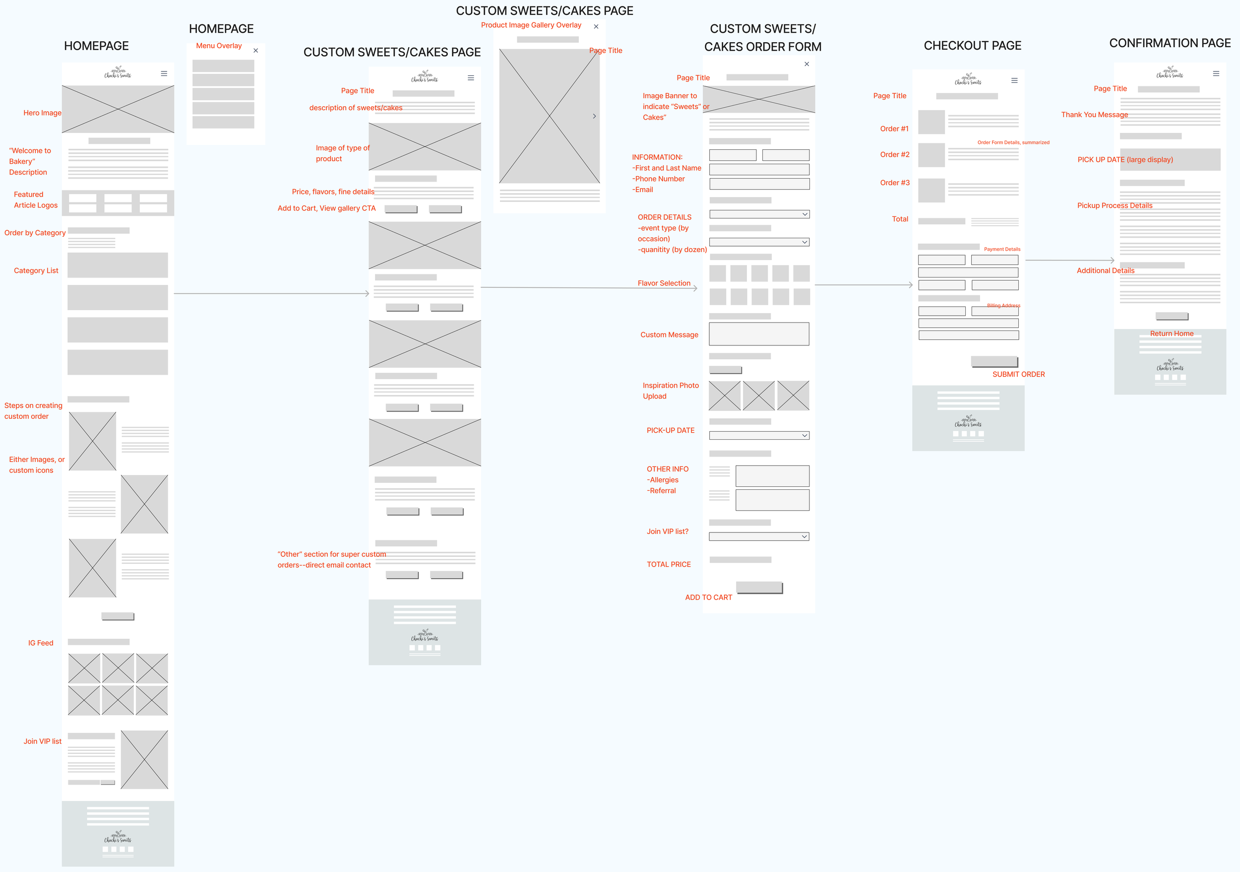
Wireframes:
Taking the initial sketch ideas, I continued to refine the flow through lo-fi wireframes.
Final Design:
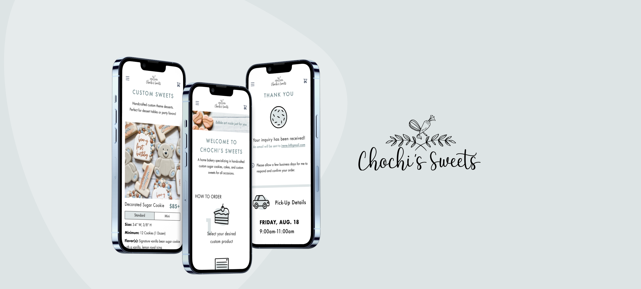
After confirming the ideas with the client and gathering insights from the user interviews, I designed the basic flow of placing an order inquiry (mobile only)
To maintain consistency, I used the client’s original photos, font, and color branding throughout the design.
PROTOTYPE & TEST
Top Usability Interview Questions:
Within the first few seconds of browsing, is there anything you expected to see but didn’t?
At first glance, can you understand what the products are/what they will look like?
How do you feel about the page layout?
Are there any fields on this form that confuse you?
Is there anything else you would want to see when booking this event?
Testing With Client:
Happy with the redesign because it felt like the theme was maintained and the content was much more organized
Continued to give insight and feedback regarding certain layouts and wording for content heavy sections
Clarified that her ordering process is more of an “interactive menu”, rather than add-to-cart style
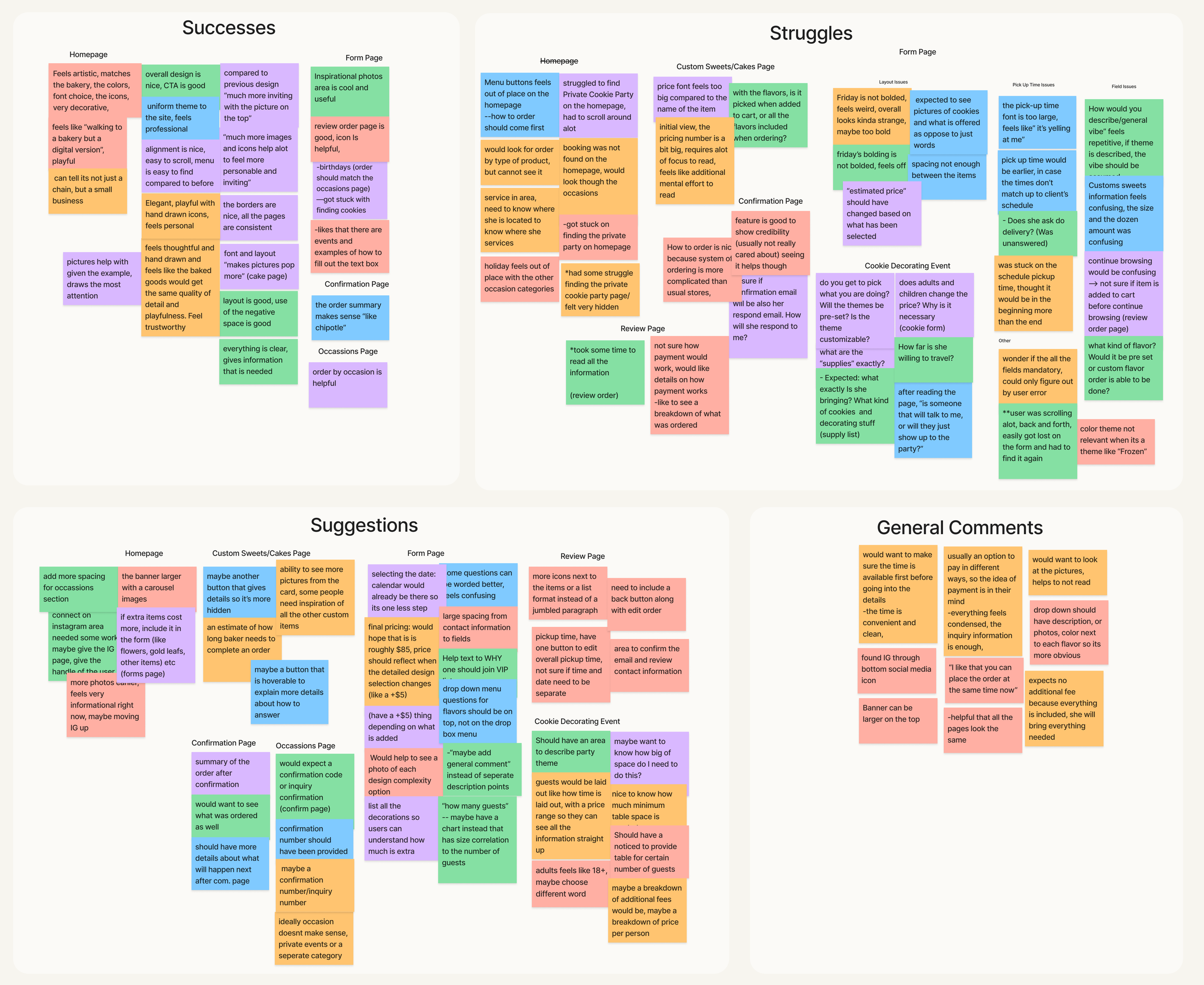
After the first round of testing with participants and the client herself, I took time to organize the insights to determine which areas on the site needed improved functionality and usability.
Affinity Map:
I separated the main interview insights into 4 main categories to better determine my priority revisions on the prototype:
Successes
Struggles
Suggestions
General Comments
Major Pain Points (Test #2)
of participants struggled with finding the links from the homepage
of participants felt like the font sizes were too large on the confirmation page and pricing total
of participants struggled with event details when booking Private Cooking Decorating Party event
of participants stated pick-up time display issues within the form process
Priority Revisions:
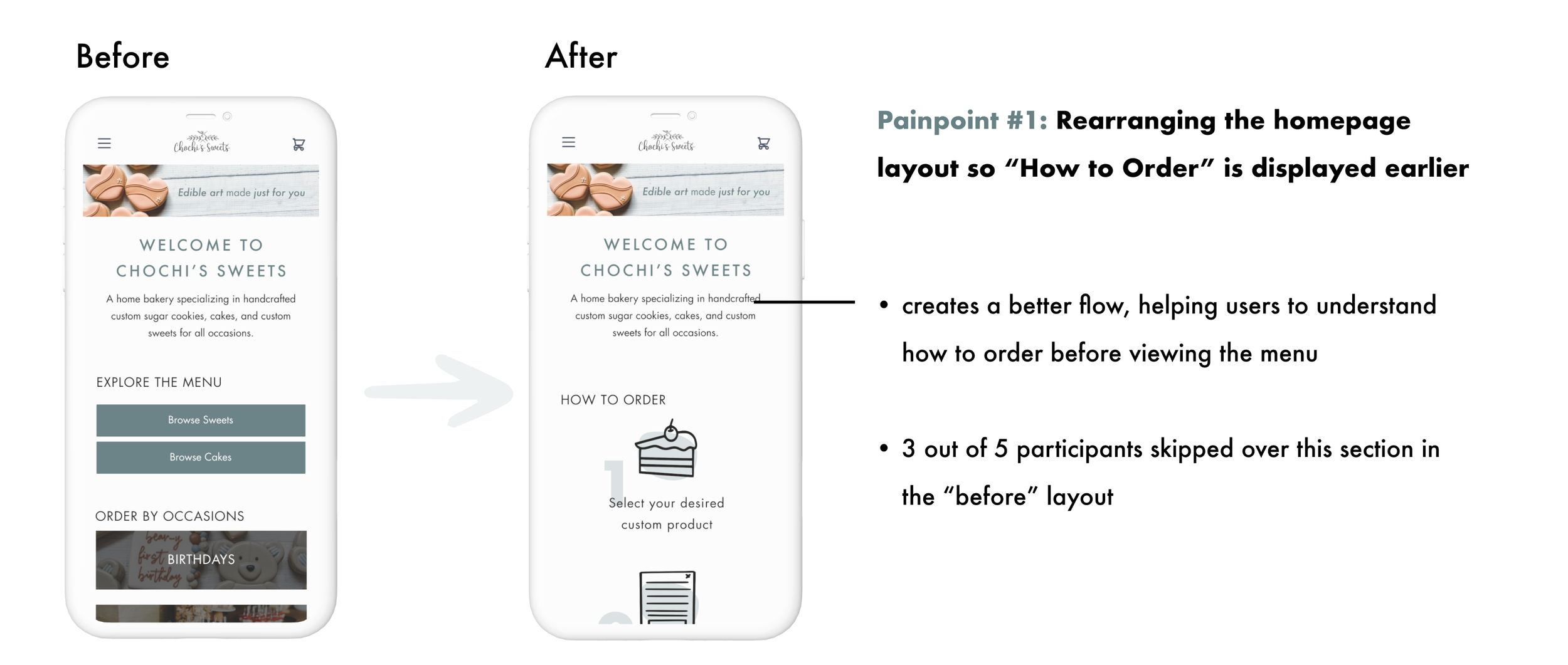
Based on the results from my usability test, I decided to iterate on the most common issues that affect the functionality of the design.
Rearranging the homepage layout so “How to Order” is displayed earlier
Adding an area for “Private Cookie Decorating Party” on the homepage
Rearranging the Form layout to stepper format and adjusting the time picker
Adding supplies section for the “Private Cookie Decorating Party” page
Adding a summary of inquiry on the confirmation page
Homepage
Forms Page
Private Cookie Decorating Party Page
Confirmation Page
Responsive Screens
What do the screens look like in desktop view?
Given the timeline of the project, I was not able to build out every screen in desktop view. However, to show the stakeholders how elements would be responsive, I built out a few screens as an example.

FINAL PROTOTYPE
NEXT STEPS
FUTURE FEATURES TO ADD:
Interactive flavor chart to help users understand what flavor they are picking
Pre-set packaged prices for 3 levels of complexity when customizing cookies
Expand and Collapse features to reduce amount of information in certain areas
Auto price adjustments when selecting number of guests for a party
IF I HAD MORE TIME…
Conduct another round of usability testing to ensure that the priority changes made were beneficial
Test with more users per round for better qualitative/quantitative data
Conduct research with past customers of the client for more realistic insights
Include more flows for the prototype during testing
Test out more versions through Live A/B testing to find the best layout
PROJECT REFLECTION:
Working through this project showed me the importance of communication with other stakeholders. Since this is my client’s existing site, I made sure to have clear explanations of design decisions by referencing back to the research at all times.
View More Projects
End-to-End App Case Study
Adding a Feature Case Study


