Heuristic Evaluation
Using the latest Disneyland App
Why should we use these guidelines?
Heuristic evaluation helps optimize usability by minimizing design deficiencies. This method is usually the most inexpensive way to get feedback, and helps prioritize issues that can be used in brainstorming sessions to help improve some initial design flaws. Since many of the issues that usually arise out of these evaluations call for an easy fix, this method allows both the designer and users to communicate the best solutions for user pain points.
What is an heuristic evaluation?
A heuristic evaluation is a design assessment performed by a UX expert to evaluate a site or product’s design against industry-standard usability principles.
These principles were originally established by Jakob Nielsen in his book “Usability Engineering,” and provide a baseline of acceptable standards in human-centered design.
To help showcase the 10 guidelines, I have conducted an evaluation on the Disneyland App. As an avid user of the app, I hope my evaluations can bring some insight to help improve the app in the near future.
Scroll down to read more!
#1: Visibility of system status
The design should always keep users informed about what is going on, through appropriate feedback within a reasonable amount of time.
What works:
1- Display of user name when logged in (and status of membership)
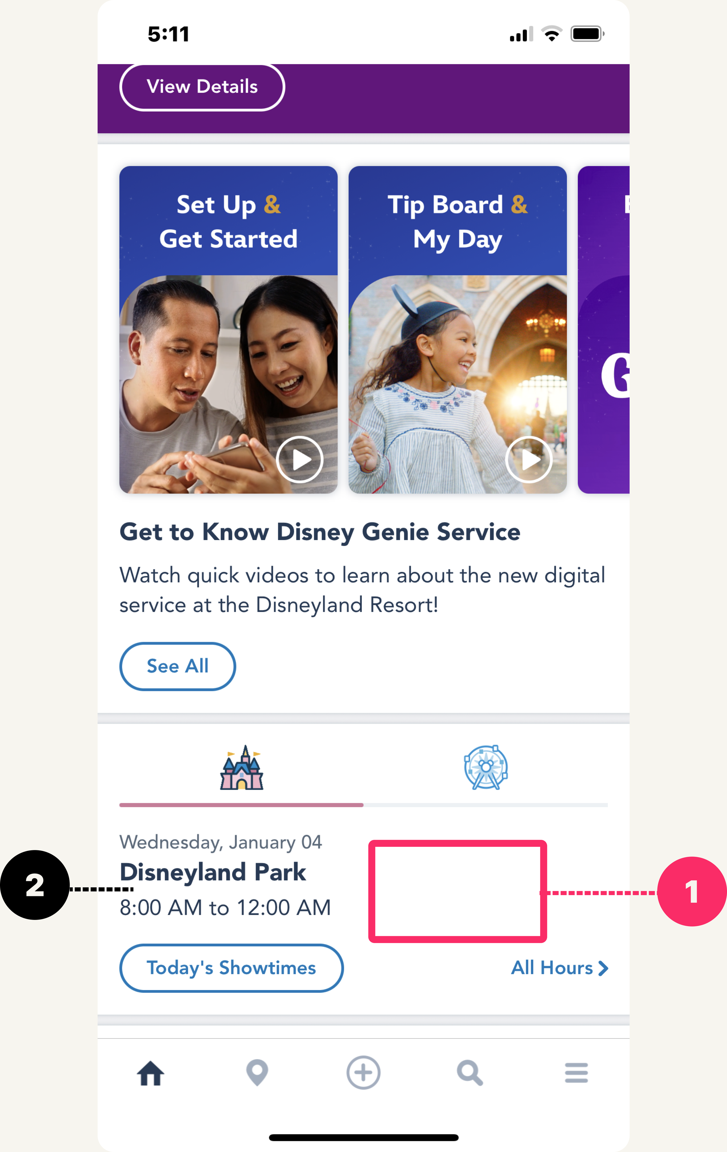
2- Accurate display of park hours, noting special event closures
3- Live map to track live wait times and forecast based on previous park history data
What to Improve:
1- Lack of live weather forecast for the parks: adding this can help users get immediate feedback to the park’s current weather and how to dress appropriately.
2- Lack of “YOU ARE HERE” on the live map to show current location, which could help users identify themselves on the map better (especially for new guests)
#2: Match between system and the real world
The design should speak the users' language. Use words, phrases, and concepts familiar to the user, rather than internal jargon. Follow real-world conventions, making information appear in a natural and logical order.
What works:
1- Clear words that explain what is happening at the parks at all times
2- Buttons that lead users to learn more about a specific feature (like Virtual Queue)
What to Improve:
1- Too many sections to read that don’t explain the initial use of the feature for new users and limitations that follow (such as Virtual Queue, MagicBand+, Genie Plus)
2- Unsure what “Tip Board” and “Play Disney Parks” are as features for new users. There is no information or keywords that can be quickly read without having to tap into the feature and tapping back out
#3: User control and freedom
Users often perform actions by mistake. They need a clearly marked "emergency exit" to leave the unwanted action without having to go through an extended process.
What works:
1- ”Cancel” actions are present when searched items are wrong
2- Back buttons are at certain screens to allow users to return back to previous page
3- Live updated zoom map that uses native function of mobile screens (pinch to zoom) allows users to search map at whatever detail they desire
What to Improve:
1- Need to open a new browser page for login again just to make certain reservations
2- Not a consistent way that pages open up when using the app and clicking through different features. Some pages open up within the app, while some pages open in a different browser
#4: Consistency and standards
Users should not have to wonder whether different words, situations, or actions mean the same thing. Follow platform and industry conventions.
What works:
1- The attractions titles have consistent information and design that reflects across the live map feature
2- Many different user paths can be taken to arrive at the same page/complete same task (like the “My Genie Day” example from Menu page to center (+) page
What to Improve:
1- Some of the items in the Menu page and center (+) page sound extremely similar, but have completely different functions (ex: “Link Photopass” vs “Disney Photopass Lenses” are different features)
2- Center (+) page says “Buy tickets and passes”, while Menu says “Tickets and passes”, which is the only place you can locate your respective pass (especially for pass holders, this is commonly used and needs to be more accessibile upon opening the app)
#5: Error prevention
Good error messages are important, but the best designs carefully prevent problems from occurring in the first place. Either eliminate error-prone conditions, or check for them and present users with a confirmation option before they commit to the action.
What works:
1- Multiple confirmations before items are bought throughout the app, and confirmations are sent
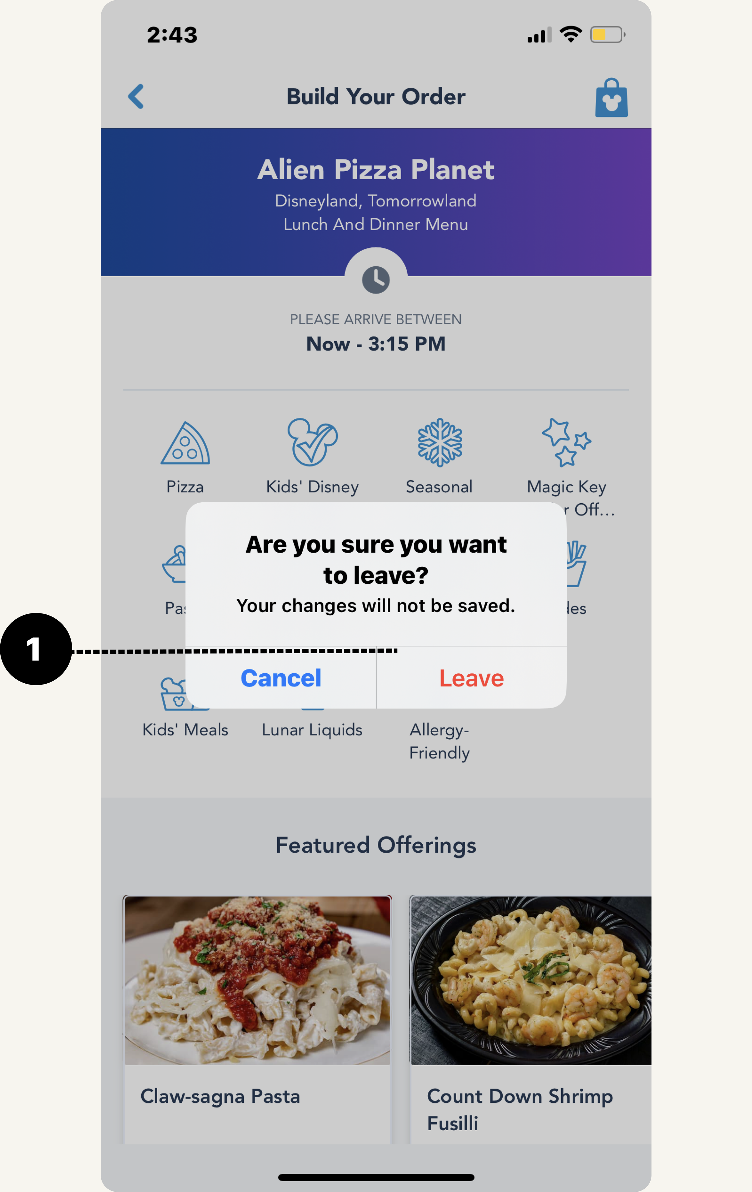
2- Push notifications sent when user is about to exit an action that cannot be saved if user goes backwards
What to Improve:
1- NONE (at the moment)
#6: Recognition rather than recall
Minimize the user's memory load by making elements, actions, and options visible. The user should not have to remember information from one part of the interface to another. Information required to use the design (e.g. field labels or menu items) should be visible or easily retrievable when needed.
What works:
1- Menu items are clearly displayed in the menu section and can provide more information if clicked into
2- Multiple ways to arrive at same page (example: Genie+ tab can be viewed from homepage, central button, or menu option and given the same information about what the function is)
3- Top used items are very easy to access. Most will use the app to get their pass, join virtual queues, order food, and check live wait times. Those items are all very accessible (Within 1-2 taps away)
What to Improve:
1- Some inconsistencies in the app copywriting can confuse new users (like how to link photos)
#7: Flexibility and efficiency of use
Shortcuts — hidden from novice users — may speed up the interaction for the expert user so that the design can cater to both inexperienced and experienced users. Allow users to tailor frequent actions.
What works:
1- When logging into the app, users are able to save their login information with Face ID for future logins (but doesn’t work when making a park reservations for some reason)
2- Saves credit card information for mobile food orders to speed up the checkout process at the parks
What to Improve:
1- Login to access making a reservation is tedious. The login process for this specific action does not allow users to save login information, and requires users to type in login information every time.
2- Some of the center (+) page functions are never used while in the parks. This area should be more useful shortcuts (such as adding a payment method) that would be used within the parks, or Ticket/Pass quick access
3- Accessing pass takes a few taps to reach and not placed in an intuitive spot in the Nav Bar. Should be added to the center (+) page for easy access
4- No shortcut to reorder the same food again. Sometimes users may forget the location of a previous order, and having previous orders may be helpful as a shortcut
#8: Aesthetic and minimalist design
Interfaces should not contain information that is irrelevant or rarely needed. Every extra unit of information in an interface competes with the relevant units of information and diminishes their relative visibility.
What works:
1- Live map automatically displays the attraction times upon opening the app, focusing on the title of the ride, location, and current wait time. This is good, because it is the #1 priority of users who use the app. Additional information on the ride is only displayed if users wish to tap further and learn more
What to Improve:
1- The homepage feels overcrowded with useless information that feels more blog-like. Homepage should have a balance of business advertising and accessibility to useful information. (ie: Disney park hours are found after scrolling past Genie+ services, which aren’t used by the general group of users)
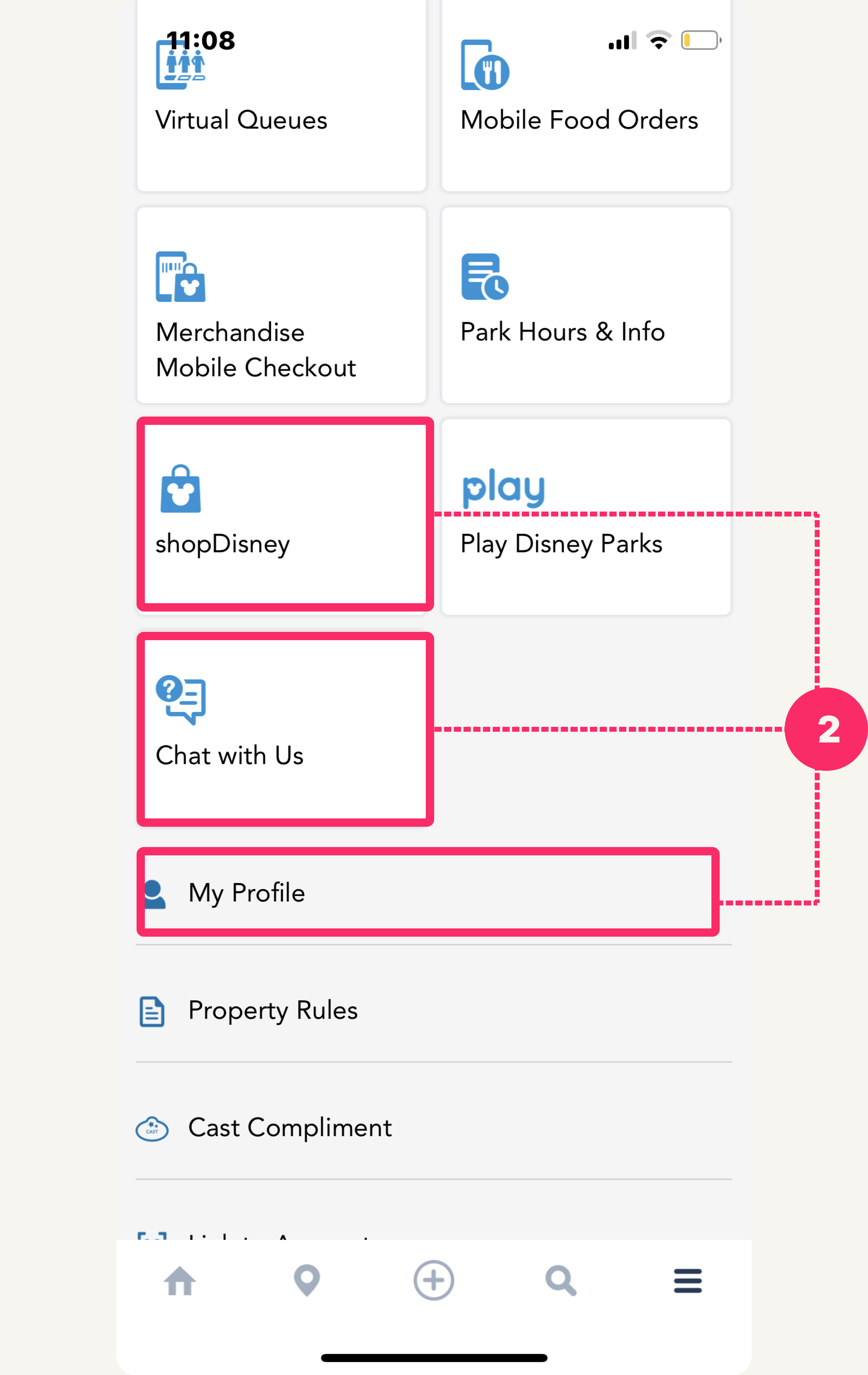
2- Some of the menu items do not have as much importance as others, but the layout makes them all seem equal (ie: ShopDisney is something that most users wouldn’t use if they were already at the parks as it has nothing to do with the park, and opens up in another browser)
#9: Help users recognize, diagnose, and recover from errors
Error messages should be expressed in plain language (no error codes), precisely indicate the problem, and constructively suggest a solution.
What works:
1- Error messages, or areas where information has not been populated, is clear and allows users to understand how to populate that space (ie: Virtual queue page appears empty if you do not have anything booked. The text prompts users in how queues work if they were interested)
What to Improve:
Overall good, nothing stands out that seems to interfere with this checkpoint
#10: Help and documentation
It’s best if the system doesn’t need any additional explanation. However, it may be necessary to provide documentation to help users understand how to complete their tasks.
What works:
1- Great onboarding video flows for those who are using brand new features (ie: Disney Photopass Lenses)
2- Steps well displayed for new features like Virtual Queue and Magic Band+ to explain their purpose and usage throughout the Parks for enhanced experience
What to Improve:
Overall good, nothing stands out that seems to interfere with this checkpoint
Project Reflection:
Although this may seem like an informal, general evaluation of some of the basic user flows within the latest Disneyland app, this was extremely beneficial to my designing process.
I learned the importance of designing with best practices in mind. The heuristic evaluation system was created out of research itself, helping designers to create a guideline to ensure the most user-friendly design systems. In all my future projects, I will be implementing this list in both my designing and testing phase to help ensure the functionality, usability, and accessibility of my product features.
Overall Evaluation Conclusion:
The app scored well within most categories of the Heuristic Evaluation. As a frequent user of the app and guest of the parks myself, I believe I speak for a small group of users who may relate to the same issues when using the app. As all things can be improved, I hope that the app can continue to improved in design with these best practices in mind.
Some of the major areas that need improvement were:
Homepage aesthetics and decluttering the feed to bring most useful park information first (#8)
Consistency in page layouts (some are in-app browsers, some are opened in new browsers) (#7)
Consistency in titles/copy so users don’t have to guess where certain features may be placed (#4)


